
![]() The city of Raleigh, North Carolina recently adopted a new city logo that cost them nearly $250,000. Raleigh is now the “City of Ferns” instead of the City of Oaks…or is that a palm branch? Or is it a feather duster? While the old logo looked like a passport stamp, this is no improvement. It even has the optical illusion of leaning to the right if you stare at it long enough. I w
The city of Raleigh, North Carolina recently adopted a new city logo that cost them nearly $250,000. Raleigh is now the “City of Ferns” instead of the City of Oaks…or is that a palm branch? Or is it a feather duster? While the old logo looked like a passport stamp, this is no improvement. It even has the optical illusion of leaning to the right if you stare at it long enough. I w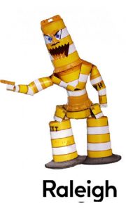 as clowning around on a Raleigh Facebook page and posted some logos that I came up with in about five minutes. While this one is facetious, it is more “Raleigh” than the fern. Anyone that remembers the NCSU student Barrel Man sculpture from 2009 will know that it captures the orange barrel culture that has dominated Raleigh since …oh…about 1971.
![]() I also did this one, which is a bit more serious, with a free clip art of an oak tree. Download the pic, change it to green, add a nice font, save…voilà! $250K in 5 minutes! Many posters from the Raleigh forum actually like this much better than the new logo.
I also did this one, which is a bit more serious, with a free clip art of an oak tree. Download the pic, change it to green, add a nice font, save…voilà! $250K in 5 minutes! Many posters from the Raleigh forum actually like this much better than the new logo.
So let’s compare the new $250K Raleigh logo to other cities and towns in North Carolina. I’m going to rate them from WORST to FIRST and give you my opinion on each.
WORST – Raleigh. See logo above. While simple is usually good, this logo does not expand on any existing branding. It is not an oak. It is a fern. It also loses all of its punch in black and white. Okay, let’s see logos from around the state!
![]() NEXT TO LAST – Asheville – Wow. What a boring logo for a town that prides itself in eclecticism, diversity, freakiness, art, culture, etc. Where are the rainbows, hippies, drums?….Heck, how about some mountains? Horrible logo.
NEXT TO LAST – Asheville – Wow. What a boring logo for a town that prides itself in eclecticism, diversity, freakiness, art, culture, etc. Where are the rainbows, hippies, drums?….Heck, how about some mountains? Horrible logo.
![]() Chapel Hill – A picture of Athena, the Greek god of who knows what is in the middle of a circle. “Athena was born from Zeus after he experienced an enormous headache and she sprang fully grown and in armor from his forehead” (credit Wikipedia). What does this logo say about the town? A UNC logo would probably be better.
Chapel Hill – A picture of Athena, the Greek god of who knows what is in the middle of a circle. “Athena was born from Zeus after he experienced an enormous headache and she sprang fully grown and in armor from his forehead” (credit Wikipedia). What does this logo say about the town? A UNC logo would probably be better.
![]() Cary – Is this a fried egg?…okay, no, it’s a dogwood blossom, I think. I do like how they incorporate Parks and Recreation into the logo. Cary certainly has one of the best P&R departments in the state. But the logo is too round. At least it’s not beige.
Cary – Is this a fried egg?…okay, no, it’s a dogwood blossom, I think. I do like how they incorporate Parks and Recreation into the logo. Cary certainly has one of the best P&R departments in the state. But the logo is too round. At least it’s not beige.
![]()
Fayetteville – Not so sure a slave auction block should be the center point of a logo and it looks very 1950ish, but in the city’s defense they’ve done an outstanding job of making this landmark a symbol of how far we’ve come. And downtown Fayetteville is beautiful. They also have a nondescript cursive writing symbol that![]() looks like the local calligraphist did it. Good for letterhead, but not much of a logo.
looks like the local calligraphist did it. Good for letterhead, but not much of a logo.
![]() Durham – When I looked up Durham’s logo, I actually expected to see a ballpark or water tower or Gothic Duke in the logo. I have not researched the stripes or the stars to know what they mean, so somebody should fill me in. I’m assuming the 1869 is the date of its incorporation or maybe the first of Duke’s basketball championships. The fact that it causes confusion to a long time NC resident places it in the middle of my rankings.
Durham – When I looked up Durham’s logo, I actually expected to see a ballpark or water tower or Gothic Duke in the logo. I have not researched the stripes or the stars to know what they mean, so somebody should fill me in. I’m assuming the 1869 is the date of its incorporation or maybe the first of Duke’s basketball championships. The fact that it causes confusion to a long time NC resident places it in the middle of my rankings.
![]() Winston-Salem – My hometown logo is nice. But what does it say about the city? It looks more like a logo for a newspaper. We’re the “Twin City”! I guess it’s better than a logo depicting Joe Camel or Stroh’s beer. How about something Moravian or Old Salem-ish?
Winston-Salem – My hometown logo is nice. But what does it say about the city? It looks more like a logo for a newspaper. We’re the “Twin City”! I guess it’s better than a logo depicting Joe Camel or Stroh’s beer. How about something Moravian or Old Salem-ish?
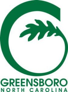
Greensboro – I gotta hand it to Greensboro. This logo is much better than many in our state. You will remember this logo even if the name of the city is not underneath. And it’s shaped like a “G”! Having lived in Greensboro for a few years, I might have incorporated luggage into the logo since it is somewhat of a suitcase town. Overall, this is a clean, crisp logo. Good job, G-boro!
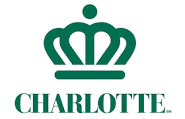 Charlotte – This is sweet and simple. The Queen City. Charlotte has had their brand for years and they’re not going to lose it with this logo, unlike Raleigh. Very classy. Good job, Charlotte! Wooo!
![]() High Point – This logo just screams “WE ARE BIG TIME! INTERNATIONAL EVEN!! GLOBAL!” And High Point is big time a couple months per year during the furniture market. It is REMARKABLE that HP has kept the market in their town all these years and it is a testament to the phrase “image is everything”. Great logo.
High Point – This logo just screams “WE ARE BIG TIME! INTERNATIONAL EVEN!! GLOBAL!” And High Point is big time a couple months per year during the furniture market. It is REMARKABLE that HP has kept the market in their town all these years and it is a testament to the phrase “image is everything”. Great logo.
![]() Apex – I really had a hard time keeping this logo from the top spot. It is just really cool. It epitomizes Apex. Old vs Modern. Railroad track is a landmark. It even shows the town on top of a hill..aka apex. And they dropped the corny “Peak of Good Living” moniker! It may be a bit cluttered from a design standpoint and looks a bit like the Sesame Street set, but I understand it is still being tweaked. But the best thing about this logo is that it was designed by a local citizen in response to a contest the Town of Apex sponsored. The winner got $500…not $5000…not $50,00….and certainly not $250,00 like the Raleigh designer got. GREAT logo, Apex!
Apex – I really had a hard time keeping this logo from the top spot. It is just really cool. It epitomizes Apex. Old vs Modern. Railroad track is a landmark. It even shows the town on top of a hill..aka apex. And they dropped the corny “Peak of Good Living” moniker! It may be a bit cluttered from a design standpoint and looks a bit like the Sesame Street set, but I understand it is still being tweaked. But the best thing about this logo is that it was designed by a local citizen in response to a contest the Town of Apex sponsored. The winner got $500…not $5000…not $50,00….and certainly not $250,00 like the Raleigh designer got. GREAT logo, Apex!
Finally….the city logo I think is the best.
![]() Wilmington – So simple, but says it all about this coastal town. This logo oozes coolness. The wave is so simple, but I love the way it flows through the dignified font.
Wilmington – So simple, but says it all about this coastal town. This logo oozes coolness. The wave is so simple, but I love the way it flows through the dignified font.
This is a gem of a post. Yea, though it was born of frustration, you sprinkled a sufficient amount of mirth, without overshadowing the main focus, that someone commissioned a cartoon for a quarter of a mil… Yipes!
Is this really your first blog attempt? I’m impressed. Well laid out. Not too lengthy, which I think is a plus. A good mixture of humor and fact. I’m not sure how I could incorporate blogging into my “style” if I have one at all. You made your point with a good, casual flow. I could easily see the “Old Ron” skillfully manipulating this format to both entertain and enrage some folks. I’ll be sure to read and comment on every item I see you post. As for “wordsmith” vs “bullshitter”…I think I can shovel it with the best of them. I have not been too satisfied with anything I’ve wrtten lately. I’m just trying to pass some time, distract my over-taxed mind and hopefully, spark some fun conversation to help to avoid pervasive negativity. I think that’s exactly what you did in your initial effort. Good job bud. Looking forward to much more. No pressure!