….and I didn’t win. I thought I was a lock for first place in the Isaac Hunter’s Tavern Raleigh Logo Contest. My logo was ![]() simple, green, great font, portable, flexible, everything you could want in a logo. The feeling of losing when you thought you’d surely win isn’t a good one. The last time I felt like this was when I played “Captain Silver” three times real fast in the Stoney Creek Elementary talent show. I was the reincarnation of Mozart for about 30 seconds! But, friggin’ Billy Grissom won the darn thing with a ventriloquist act!!! The same kid that relegated me to SECOND place in every spelling contest from 1st to 5th grade. (P.S. his lips moved). But, my frustrations during my formative years is a another topic for another time.
simple, green, great font, portable, flexible, everything you could want in a logo. The feeling of losing when you thought you’d surely win isn’t a good one. The last time I felt like this was when I played “Captain Silver” three times real fast in the Stoney Creek Elementary talent show. I was the reincarnation of Mozart for about 30 seconds! But, friggin’ Billy Grissom won the darn thing with a ventriloquist act!!! The same kid that relegated me to SECOND place in every spelling contest from 1st to 5th grade. (P.S. his lips moved). But, my frustrations during my formative years is a another topic for another time.
The w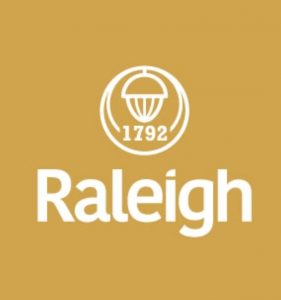 inner of the contest was this one. I’m not diggin’ the baby poop beige or the abstract acorn. And this was designed by a real professional designer. It certainly wasn’t even in my top ten. Beige is for mini vans. Beige is for camouflage. Beige is for…well…Cary.
After reviewing all 40 entrants in the contest, I came up with a list of the WORST and BEST.
WORST – in no particular order
![]() Okay, this one may have been done by a middle schooler, so forgive me. But if you’re gonna enter a contest open to pros, you’re going to have to face the scrutiny. File that under “Life Lesson”. A talented seven year old could do this well. The gumball tree says nothing about Raleigh, nor does the map of Africa. And who knew you could walk from Morocco to southern Spain? I could have saved the $75 I spent last time I took the ferry.
Okay, this one may have been done by a middle schooler, so forgive me. But if you’re gonna enter a contest open to pros, you’re going to have to face the scrutiny. File that under “Life Lesson”. A talented seven year old could do this well. The gumball tree says nothing about Raleigh, nor does the map of Africa. And who knew you could walk from Morocco to southern Spain? I could have saved the $75 I spent last time I took the ferry.
![]()
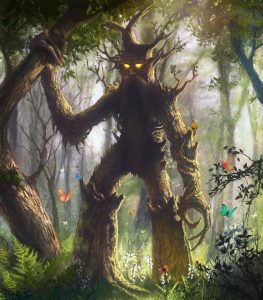 This one is just plain scary. This brings back memories of the walking tree men (Ents) in Lord of the Rings. But instead of destroying Isengard, they are destroying Raleigh!!! And it looks like (judging from the heart and musical notes) that the citizens are enjoying it! The Babes in Toyland trees, the Wizard of Oz trees, and the HR Pufnstuf trees gave me nightmares for years, so maybe I’m overreacting. The logo still sucks, though.
![]() Here’s another one that says nothing about Raleigh. It looks like a page
Here’s another one that says nothing about Raleigh. It looks like a page 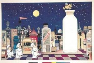 out of the children’s book, “The Night Kitchen.” Just add a naked baby and three drunk bakers and the logo would be complete. Either that or an “in the hood” version of “Goodnight Moon.”
![]() I just KNEW somebody would enter this contest with a logo created solely with MSPaint. You can
I just KNEW somebody would enter this contest with a logo created solely with MSPaint. You can 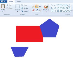 tell by the horrible default blue and red colors and the bad placement of the trapezoids using the Shapes feature in Paint. The insertion of a nondescript skyline and clip art acorn and oak leaf makes this a MS Paint masterpiece. But not a logo.
![]() Wow. I wasn’t quite sure to include this one in the BAD or GOOD category. I actually think it is kinda cool. Who doesn’t eat an ice cream cone while playing guitar? Who doesn’t like squirrels with great ideas? Who doesn’t like chickens laying asterisks? There is a LOT going on in this creation. I would have bought a poster of this design in the late 60’s (as long as it was purple and a black light poster). Even though I admire the creativity, it is not much of a logo.
Wow. I wasn’t quite sure to include this one in the BAD or GOOD category. I actually think it is kinda cool. Who doesn’t eat an ice cream cone while playing guitar? Who doesn’t like squirrels with great ideas? Who doesn’t like chickens laying asterisks? There is a LOT going on in this creation. I would have bought a poster of this design in the late 60’s (as long as it was purple and a black light poster). Even though I admire the creativity, it is not much of a logo.
![]()
This one is kinda neat. As a long time NC resident, I know that the little silhouette of a man (scaramooch) is Sir Walter Raleigh. But would somebody from, say, SOUTH Carolina, know that it wasn’t one of the Three Musketeers? Wouldn’t a Virginia resident think it is a Cavalier? Is it Zorro? Regardless, what is SWR doing in a light bulb? It reminds me of the old “Do you have Sir Walter Raleigh in a can?” telephone prank. This is more of a 4am tattoo design than a logo.
![]() This one is the WORST of all. It was probably designed by a professional or at least an adult. At first glance it looks pretty good. But after closer examination….nothing says “Raleigh, City of Oaks” like friggin’ MAPLE LEAVES. Eh? Whoever designed this logo is a hoser.
This one is the WORST of all. It was probably designed by a professional or at least an adult. At first glance it looks pretty good. But after closer examination….nothing says “Raleigh, City of Oaks” like friggin’ MAPLE LEAVES. Eh? Whoever designed this logo is a hoser.
It would be like me entering a Toronto Logo Design Contest and incorporating tobacco leaves.
Can you imagine if the designer was paid $250K and presented this to the Raleigh City Council? Okay, don’t answer that. They’d probably love it.
And now the GOOD!
![]()
I really like this one. It looks like an actual oak tree. It hints at the blending of the old with the new in Raleigh, although most of the “new” in Raleigh is unblended high priced condos, upscale coffee shops and boutique hotels. Give me the beer soaked cement floors of 1970’s Hillsborough St. bars, the IHop and the “rotating” Holiday Inn! Sorry. I get worked up over this topic since Sadlack’s was torn down. The only gripe I have about the designers of this logo is that they entered multiple times using the same basic half new / half old tree design. Don’t stuff the ballot box, just enter your best.
![]() This one coulda been a contender. It’s green, round, has oak leaves, an elegant font….but the acorn looks like an eggplant!!
This one coulda been a contender. It’s green, round, has oak leaves, an elegant font….but the acorn looks like an eggplant!!
Come on, designer, you blew it! An acorn is short and squatty and does NOT look like a circumcised penis! Other than that small defect, I like this one.
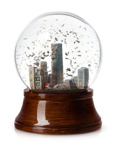
![]() The “surprised acorn” design. I still like it because it shows the skyline in an appropriately proportioned acorn, even though it kinda reminds me of a snow globe.
The “surprised acorn” design. I still like it because it shows the skyline in an appropriately proportioned acorn, even though it kinda reminds me of a snow globe.
![]()
This one is cool. I like the casual font as the top of the acorn. The only drawback is that it looks more like a logo for a coffee shop. Brown is not a good color for ANYTHING other than coffee shops and grandpa sweaters. Brown is a neutral color. Who wants to be neutral??? From color-meanings.com: “Brown does not seek attention at all, it prefers to stay in the background, so others around it can shine.” Charlotte would love Raleigh to have this logo. Still nice, though.
![]() This is my winner (other than my design, of course). Great colors. Very portable….I can see this on letterhead, tee shirts, hats, golf balls and other marketing material. It’s bold and new.
This is my winner (other than my design, of course). Great colors. Very portable….I can see this on letterhead, tee shirts, hats, golf balls and other marketing material. It’s bold and new.
It also resembles the letter “R” and the triangle (get it?) is a nice touch. Kudos to whoever designed this one. Your design is a solid second place to moi.
To see all of the designs in the contest, visit GreatRaleigh.com!